Decreased in Bone Density Chart
Image Description:
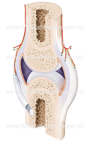
This chart illustration aims to show what the decrease of bone density looks like in comparison to healthy bone. Using a section of the thoracic spine the call out shows the density of healthy bone and compares it to bone that has decreased in density. The scales are there to highlight the fact that there is bone loss and a decrease in density between two sections of bone. Bone loss can occur when more old bone is reabsorbed than new bone is created.
Image File Sizes:
|
Size |
Pixels |
Inches (@300dpi) |
cm (@300dpi) |
|
Small |
600 x 313px |
2.0 x 1.0” |
5.1 x 2.7cm |
|
Medium |
1200 x 626px |
4.0 x 2.1” |
10.2 x 5.3cm |
|
Large |
2460 x 1283px |
8.2 x 4.3” |
20.8 x 10.9cm |
Anatomy Visible in the Medical Illustration Includes:
Bone, density, decrease, minerals, thoracic, spine, vertebra.
Image created by:
We Also Recommend